- Forums
- Support and Presales
- Developer Members Support
- CSS issue with last build 2.5.0+build.2021.04.29.15.02.30.7d834e754
CSS issue with last build 2.5.0+build.2021.04.29.15.02.30.7d834e754
- activha

- OFFLINE
-
Platinum Member

- Posts: 2278
- Thanks: 113
- Karma: 13

2 years 11 months ago #324591
by activha
CSS issue with last build 2.5.0+build.2021.04.29.15.02.30.7d834e754 was created by activha
Hello
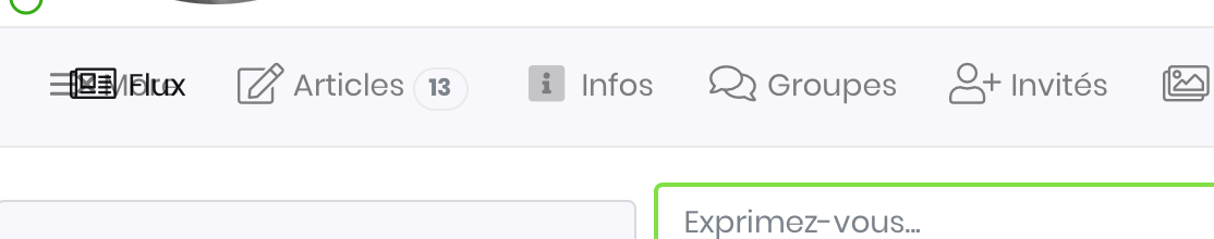
Seems like the "more" word is added in the menu bar over the first tab name
Is it intentional ? is there any new setting ?
thanks
Seems like the "more" word is added in the menu bar over the first tab name
Is it intentional ? is there any new setting ?
thanks
Please Log in to join the conversation.
 krileon
 Team Member
- OFFLINE
- Posts: 68521
- Thanks: 9091
- Karma: 1434

2 years 11 months ago #324592
by krileon
Kyle (Krileon)
Community Builder Team Member
Before posting on forums: Read FAQ thoroughly + Read our Documentation + Search the forums
CB links: Documentation - Localization - CB Quickstart - CB Paid Subscriptions - Add-Ons - Forge
--
If you are a Professional, Developer, or CB Paid Subscriptions subscriber and have a support issue please always post in your respective support forums for best results!
--
If I've missed your support post with a delay of 3 days or greater and are a Professional, Developer, or CBSubs subscriber please send me a private message with your thread and will reply when possible!
--
Please note I am available Monday - Friday from 8:00 AM CST to 4:00 PM CST. I am away on weekends (Saturday and Sunday) and if I've missed your post on or before a weekend after business hours please wait for the next following business day (Monday) and will get to your issue as soon as possible, thank you.
--
My role here is to provide guidance and assistance. I cannot provide custom code for each custom requirement. Please do not inquire me about custom development.
Replied by krileon on topic CSS issue with last build 2.5.0+build.2021.04.29.15.02.30.7d834e754
I recall you implemented custom CSS for the canvas tab menu. Remove that custom CSS and retry. We've a new auto-overflow handling behavior for our tab menu and menu usages. It works as follows.
Desktop:
Responsive:
Responsive Menu:
This eliminates needing a hamburger menu and will show as many menu items as it can based off space available before going responsive.
Desktop:
Responsive:
Responsive Menu:
This eliminates needing a hamburger menu and will show as many menu items as it can based off space available before going responsive.
Kyle (Krileon)
Community Builder Team Member
Before posting on forums: Read FAQ thoroughly + Read our Documentation + Search the forums
CB links: Documentation - Localization - CB Quickstart - CB Paid Subscriptions - Add-Ons - Forge
--
If you are a Professional, Developer, or CB Paid Subscriptions subscriber and have a support issue please always post in your respective support forums for best results!
--
If I've missed your support post with a delay of 3 days or greater and are a Professional, Developer, or CBSubs subscriber please send me a private message with your thread and will reply when possible!
--
Please note I am available Monday - Friday from 8:00 AM CST to 4:00 PM CST. I am away on weekends (Saturday and Sunday) and if I've missed your post on or before a weekend after business hours please wait for the next following business day (Monday) and will get to your issue as soon as possible, thank you.
--
My role here is to provide guidance and assistance. I cannot provide custom code for each custom requirement. Please do not inquire me about custom development.
Attachments:
Please Log in to join the conversation.
- activha
- OFFLINE
-
Platinum Member
- Posts: 2278
- Thanks: 113
- Karma: 13
2 years 11 months ago #324596
by activha
Replied by activha on topic CSS issue with last build 2.5.0+build.2021.04.29.15.02.30.7d834e754
Good catch ")
I did not even remember it, solved
Thanks a lot
I did not even remember it, solved
Thanks a lot
The following user(s) said Thank You: krileon
Please Log in to join the conversation.
- activha
- OFFLINE
-
Platinum Member
- Posts: 2278
- Thanks: 113
- Karma: 13
2 years 11 months ago - 2 years 11 months ago #324606
by activha
Replied by activha on topic CSS issue with last build 2.5.0+build.2021.04.29.15.02.30.7d834e754
Hi again
I have noticed that on Groupjive menu on small screens the more button always appear, thus hiding the first menus and this is a bad user experience for new users.
Honestly I prefer the old behavior with scrolling and an indication of scroll ability like this one activ-ha.com/pages/13-campagnes-marketing/55-activ-h-a-negopack
This feels much more user friendly on mobiles where people are used to sliding.
How can I retrieve the old behavior for all menu ? and remove the more button ?
Last edit: 2 years 11 months ago by activha.
Please Log in to join the conversation.
- krileon
- Team Member
- OFFLINE
- Posts: 68521
- Thanks: 9091
- Karma: 1434
2 years 11 months ago #324610
by krileon
Kyle (Krileon)
Community Builder Team Member
Before posting on forums: Read FAQ thoroughly + Read our Documentation + Search the forums
CB links: Documentation - Localization - CB Quickstart - CB Paid Subscriptions - Add-Ons - Forge
--
If you are a Professional, Developer, or CB Paid Subscriptions subscriber and have a support issue please always post in your respective support forums for best results!
--
If I've missed your support post with a delay of 3 days or greater and are a Professional, Developer, or CBSubs subscriber please send me a private message with your thread and will reply when possible!
--
Please note I am available Monday - Friday from 8:00 AM CST to 4:00 PM CST. I am away on weekends (Saturday and Sunday) and if I've missed your post on or before a weekend after business hours please wait for the next following business day (Monday) and will get to your issue as soon as possible, thank you.
--
My role here is to provide guidance and assistance. I cannot provide custom code for each custom requirement. Please do not inquire me about custom development.
Replied by krileon on topic CSS issue with last build 2.5.0+build.2021.04.29.15.02.30.7d834e754
There should not be a more button in CB GroupJive as the current build doesn't have any of that implemented. It doesn't have the root CSS class that's responsible for styling the new behavior so it can't impact GJ. CB GroupJive will still use the hamburger menu until next major GJ release. You can see that this is the case on our demo site below.
demo.cbdemosites.com/demos/cb-groupjive/all-groups/1-community-builder-add-ons/26-cb-template-changer
I'm guessing you added custom CSS to CB GroupJive as well.
A major CB GroupJive release is already being worked with a full UX pass and its tab menu updated to the new responsive usage.
demo.cbdemosites.com/demos/cb-groupjive/all-groups/1-community-builder-add-ons/26-cb-template-changer
I'm guessing you added custom CSS to CB GroupJive as well.
A major CB GroupJive release is already being worked with a full UX pass and its tab menu updated to the new responsive usage.
That was terrible UX and is why it was replaced with a hamburger usage a lot time ago. The scrollers were hard to tap on mobile and hard to notice.Honestly I prefer the old behavior with scrolling and an indication of scroll ability like this one activ-ha.com/pages/13-campagnes-marketing/55-activ-h-a-negopack
Left/Right scrollers aren't mobile friendly. It disrupts the direction flow of mobile which is scrolling down to suddenly scroll left/right and depending on how things overflow users may not even realize there's more content left/right.This feels much more user friendly on mobiles where people are used to sliding.
Write custom CSS to style it to however you like.How can I retrieve the old behavior for all menu ? and remove the more button ?
Kyle (Krileon)
Community Builder Team Member
Before posting on forums: Read FAQ thoroughly + Read our Documentation + Search the forums
CB links: Documentation - Localization - CB Quickstart - CB Paid Subscriptions - Add-Ons - Forge
--
If you are a Professional, Developer, or CB Paid Subscriptions subscriber and have a support issue please always post in your respective support forums for best results!
--
If I've missed your support post with a delay of 3 days or greater and are a Professional, Developer, or CBSubs subscriber please send me a private message with your thread and will reply when possible!
--
Please note I am available Monday - Friday from 8:00 AM CST to 4:00 PM CST. I am away on weekends (Saturday and Sunday) and if I've missed your post on or before a weekend after business hours please wait for the next following business day (Monday) and will get to your issue as soon as possible, thank you.
--
My role here is to provide guidance and assistance. I cannot provide custom code for each custom requirement. Please do not inquire me about custom development.
Please Log in to join the conversation.
- activha
- OFFLINE
-
Platinum Member
- Posts: 2278
- Thanks: 113
- Karma: 13
2 years 11 months ago - 2 years 11 months ago #324611
by activha
Let me disagree with this. All mobile apps rely on sliding left and right to access uses (take iOS Apple Mail for an example)
We implemented PWA with joomla so that the website behaves like a web app and sliding menu are very user friendly.
For hints, it's easy to implement a small line under the menus as we did.
But ok we'll keep our own css
Replied by activha on topic CSS issue with last build 2.5.0+build.2021.04.29.15.02.30.7d834e754
Left/Right scrollers aren't mobile friendly.
Let me disagree with this. All mobile apps rely on sliding left and right to access uses (take iOS Apple Mail for an example)
We implemented PWA with joomla so that the website behaves like a web app and sliding menu are very user friendly.
For hints, it's easy to implement a small line under the menus as we did.
But ok we'll keep our own css
Last edit: 2 years 11 months ago by activha.
Please Log in to join the conversation.
Moderators: beat, nant, krileon
- Forums
- Support and Presales
- Developer Members Support
- CSS issue with last build 2.5.0+build.2021.04.29.15.02.30.7d834e754
Time to create page: 0.285 seconds


-
You are here:
- Home
- Forums
- Support and Presales
- Developer Members Support
- CSS issue with last build 2.5.0+build.2021.04.29.15.02.30.7d834e754