Preselected Price Option
- galanopd

- OFFLINE
-
Platinum Member

- Posts: 332
- Thanks: 44
- Karma: 8

1 year 9 months ago #330055
by galanopd
Preselected Price Option was created by galanopd
When setting a plan Workflows->Selected by default to No and there are no Integrations->Options->Prices, all work fine.
In case there are Integrations->Options->Prices in child plans and Parent plan has more than 1 child e.g. 2, 3, etc., then child plans with Options have preselected option. In case of radio buttons they can't unselect so the subscription doesn't conclude in case of exclusive.
In case there are Integrations->Options->Prices in child plans and Parent plan has more than 1 child e.g. 2, 3, etc., then child plans with Options have preselected option. In case of radio buttons they can't unselect so the subscription doesn't conclude in case of exclusive.
Please Log in to join the conversation.
 krileon
 Team Member
- OFFLINE
- Posts: 68524
- Thanks: 9091
- Karma: 1434

1 year 9 months ago #330057
by krileon
Kyle (Krileon)
Community Builder Team Member
Before posting on forums: Read FAQ thoroughly + Read our Documentation + Search the forums
CB links: Documentation - Localization - CB Quickstart - CB Paid Subscriptions - Add-Ons - Forge
--
If you are a Professional, Developer, or CB Paid Subscriptions subscriber and have a support issue please always post in your respective support forums for best results!
--
If I've missed your support post with a delay of 3 days or greater and are a Professional, Developer, or CBSubs subscriber please send me a private message with your thread and will reply when possible!
--
Please note I am available Monday - Friday from 8:00 AM CST to 4:00 PM CST. I am away on weekends (Saturday and Sunday) and if I've missed your post on or before a weekend after business hours please wait for the next following business day (Monday) and will get to your issue as soon as possible, thank you.
--
My role here is to provide guidance and assistance. I cannot provide custom code for each custom requirement. Please do not inquire me about custom development.
Replied by krileon on topic Preselected Price Option
Sorry, not sure I understand. Can you provide steps to reproduce and a screenshot of it not working correctly? Are you saying that the price isn't updating for a plan that's pre-selected?
Kyle (Krileon)
Community Builder Team Member
Before posting on forums: Read FAQ thoroughly + Read our Documentation + Search the forums
CB links: Documentation - Localization - CB Quickstart - CB Paid Subscriptions - Add-Ons - Forge
--
If you are a Professional, Developer, or CB Paid Subscriptions subscriber and have a support issue please always post in your respective support forums for best results!
--
If I've missed your support post with a delay of 3 days or greater and are a Professional, Developer, or CBSubs subscriber please send me a private message with your thread and will reply when possible!
--
Please note I am available Monday - Friday from 8:00 AM CST to 4:00 PM CST. I am away on weekends (Saturday and Sunday) and if I've missed your post on or before a weekend after business hours please wait for the next following business day (Monday) and will get to your issue as soon as possible, thank you.
--
My role here is to provide guidance and assistance. I cannot provide custom code for each custom requirement. Please do not inquire me about custom development.
Please Log in to join the conversation.
- galanopd
- OFFLINE
-
Platinum Member
- Posts: 332
- Thanks: 44
- Karma: 8
1 year 9 months ago - 1 year 9 months ago #330058
by galanopd
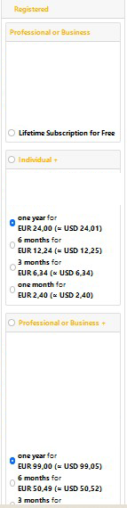
You will notice that 2 plans are pre-selected. This happens for every plan that has Price Options
That is causing a problem when selecting exclusive plans of same parent
EDIT: Even more mess with more than 1 parent
Replied by galanopd on topic Preselected Price Option
You will notice that 2 plans are pre-selected. This happens for every plan that has Price Options
No prices work fine. When using Price Options it uses the original plan price as default and it is preselected.Sorry, not sure I understand. Can you provide steps to reproduce and a screenshot of it not working correctly? Are you saying that the price isn't updating for a plan that's pre-selected?
That is causing a problem when selecting exclusive plans of same parent
EDIT: Even more mess with more than 1 parent
Attachments:
Last edit: 1 year 9 months ago by galanopd.
Please Log in to join the conversation.
- krileon
- Team Member
- OFFLINE
- Posts: 68524
- Thanks: 9091
- Karma: 1434
1 year 9 months ago #330066
by krileon
Kyle (Krileon)
Community Builder Team Member
Before posting on forums: Read FAQ thoroughly + Read our Documentation + Search the forums
CB links: Documentation - Localization - CB Quickstart - CB Paid Subscriptions - Add-Ons - Forge
--
If you are a Professional, Developer, or CB Paid Subscriptions subscriber and have a support issue please always post in your respective support forums for best results!
--
If I've missed your support post with a delay of 3 days or greater and are a Professional, Developer, or CBSubs subscriber please send me a private message with your thread and will reply when possible!
--
Please note I am available Monday - Friday from 8:00 AM CST to 4:00 PM CST. I am away on weekends (Saturday and Sunday) and if I've missed your post on or before a weekend after business hours please wait for the next following business day (Monday) and will get to your issue as soon as possible, thank you.
--
My role here is to provide guidance and assistance. I cannot provide custom code for each custom requirement. Please do not inquire me about custom development.
Replied by krileon on topic Preselected Price Option
That shouldn't do anything unless that plan was actually selected. So that'd be an entirely cosmetic problem.
Kyle (Krileon)
Community Builder Team Member
Before posting on forums: Read FAQ thoroughly + Read our Documentation + Search the forums
CB links: Documentation - Localization - CB Quickstart - CB Paid Subscriptions - Add-Ons - Forge
--
If you are a Professional, Developer, or CB Paid Subscriptions subscriber and have a support issue please always post in your respective support forums for best results!
--
If I've missed your support post with a delay of 3 days or greater and are a Professional, Developer, or CBSubs subscriber please send me a private message with your thread and will reply when possible!
--
Please note I am available Monday - Friday from 8:00 AM CST to 4:00 PM CST. I am away on weekends (Saturday and Sunday) and if I've missed your post on or before a weekend after business hours please wait for the next following business day (Monday) and will get to your issue as soon as possible, thank you.
--
My role here is to provide guidance and assistance. I cannot provide custom code for each custom requirement. Please do not inquire me about custom development.
Please Log in to join the conversation.
- krileon
- Team Member
- OFFLINE
- Posts: 68524
- Thanks: 9091
- Karma: 1434
1 year 9 months ago #330067
by krileon
Kyle (Krileon)
Community Builder Team Member
Before posting on forums: Read FAQ thoroughly + Read our Documentation + Search the forums
CB links: Documentation - Localization - CB Quickstart - CB Paid Subscriptions - Add-Ons - Forge
--
If you are a Professional, Developer, or CB Paid Subscriptions subscriber and have a support issue please always post in your respective support forums for best results!
--
If I've missed your support post with a delay of 3 days or greater and are a Professional, Developer, or CBSubs subscriber please send me a private message with your thread and will reply when possible!
--
Please note I am available Monday - Friday from 8:00 AM CST to 4:00 PM CST. I am away on weekends (Saturday and Sunday) and if I've missed your post on or before a weekend after business hours please wait for the next following business day (Monday) and will get to your issue as soon as possible, thank you.
--
My role here is to provide guidance and assistance. I cannot provide custom code for each custom requirement. Please do not inquire me about custom development.
Replied by krileon on topic Preselected Price Option
Ok, have improved the behavior for radio based plan price options. They'll now initially display as unchecked and will toggle the first option selected when the plan is selected or of course if the price option is selected. This however was still an entirely cosmetic issue in my tests.
forge.joomlapolis.com/issues/8993
forge.joomlapolis.com/issues/8993
Kyle (Krileon)
Community Builder Team Member
Before posting on forums: Read FAQ thoroughly + Read our Documentation + Search the forums
CB links: Documentation - Localization - CB Quickstart - CB Paid Subscriptions - Add-Ons - Forge
--
If you are a Professional, Developer, or CB Paid Subscriptions subscriber and have a support issue please always post in your respective support forums for best results!
--
If I've missed your support post with a delay of 3 days or greater and are a Professional, Developer, or CBSubs subscriber please send me a private message with your thread and will reply when possible!
--
Please note I am available Monday - Friday from 8:00 AM CST to 4:00 PM CST. I am away on weekends (Saturday and Sunday) and if I've missed your post on or before a weekend after business hours please wait for the next following business day (Monday) and will get to your issue as soon as possible, thank you.
--
My role here is to provide guidance and assistance. I cannot provide custom code for each custom requirement. Please do not inquire me about custom development.
The following user(s) said Thank You: galanopd
Please Log in to join the conversation.
- galanopd
- OFFLINE
-
Platinum Member
- Posts: 332
- Thanks: 44
- Karma: 8
1 year 9 months ago - 1 year 9 months ago #330071
by galanopd
Although it can be understood by a developer or an advanced user, it would definitely create issues to a user that is not so familiar to see all radios checked, right? In any case I saw you have already fixed it, so all super.
Thanks
EDIT: The following might be intersting
There is a confusion in child plans and their options.
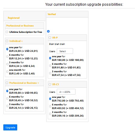
In case a child plan has Options->Prices activated then a radio button appears beside plan's name, otherwise no. This happens as stated above to avoid confict between plans unless this radio is selected. I believe it would be much better if in the case where Options->Prices is not activated (see Individual) and therefore there is only one option for the plan, this option not to have a radio but the radio to appear beside its plan's name. It makes no sense to select the option since it is only one but it does make sense to select the plan. In the example above the radio would be beside the name Individual. It would be better for the user to understand that unless the radio beside Child Plan's name is selected, the plan won't be active. This way it is much more clear that selecting options doesn't select the plan but the plan is selected only if the radio beside plan's name is selected like in the case of Individual+. So both Individual and Individual+ will work with the same logic. This is only a matter of uniformity but IMHO helpful.
Replied by galanopd on topic Preselected Price Option
I agree with you. I thought it was conflicting due to forge.joomlapolis.com/issues/8886 .This however was still an entirely cosmetic issue in my tests.
Although it can be understood by a developer or an advanced user, it would definitely create issues to a user that is not so familiar to see all radios checked, right? In any case I saw you have already fixed it, so all super.
Thanks
EDIT: The following might be intersting
There is a confusion in child plans and their options.
In case a child plan has Options->Prices activated then a radio button appears beside plan's name, otherwise no. This happens as stated above to avoid confict between plans unless this radio is selected. I believe it would be much better if in the case where Options->Prices is not activated (see Individual) and therefore there is only one option for the plan, this option not to have a radio but the radio to appear beside its plan's name. It makes no sense to select the option since it is only one but it does make sense to select the plan. In the example above the radio would be beside the name Individual. It would be better for the user to understand that unless the radio beside Child Plan's name is selected, the plan won't be active. This way it is much more clear that selecting options doesn't select the plan but the plan is selected only if the radio beside plan's name is selected like in the case of Individual+. So both Individual and Individual+ will work with the same logic. This is only a matter of uniformity but IMHO helpful.
Attachments:
Last edit: 1 year 9 months ago by galanopd.
Please Log in to join the conversation.
Moderators: beat, nant, krileon
Time to create page: 0.209 seconds


-
You are here:
- Home
- Forums
- Support and Presales
- Developer Members Support
- Preselected Price Option